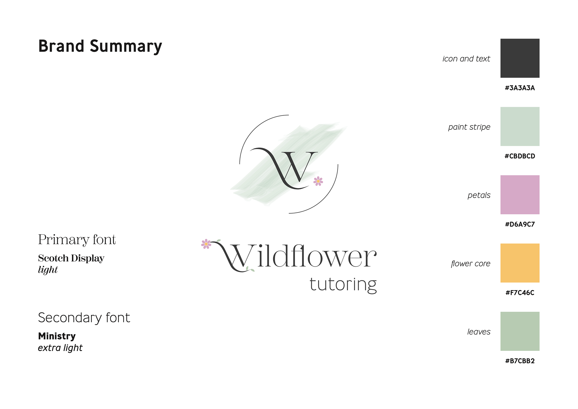

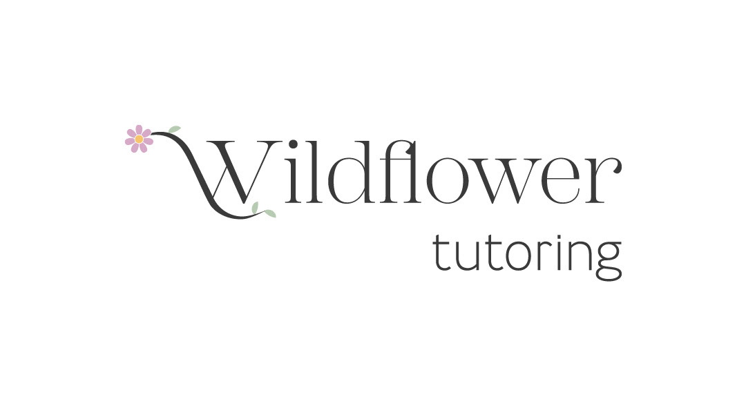
This logo design was completed for a client who wanted something fresh, minimalistic and yet conveys a sense of creativity and femininity. There was a desire to keep the colours in muted pastels and seek something that was a little more gender neutral - hence the choice of sage green for the primary paint stripe.
The concept was very much directed by the client and this was the final result following multiple concept reviews and conversations with the clients. They are interested in expanding into different streams so also wanted something that could be adapted for different iterations such as childcare or music teaching etc.