Current Brand and Logos
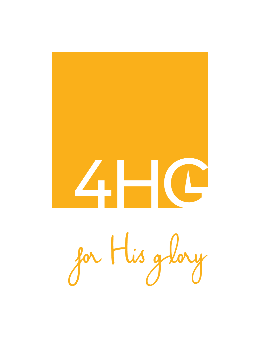
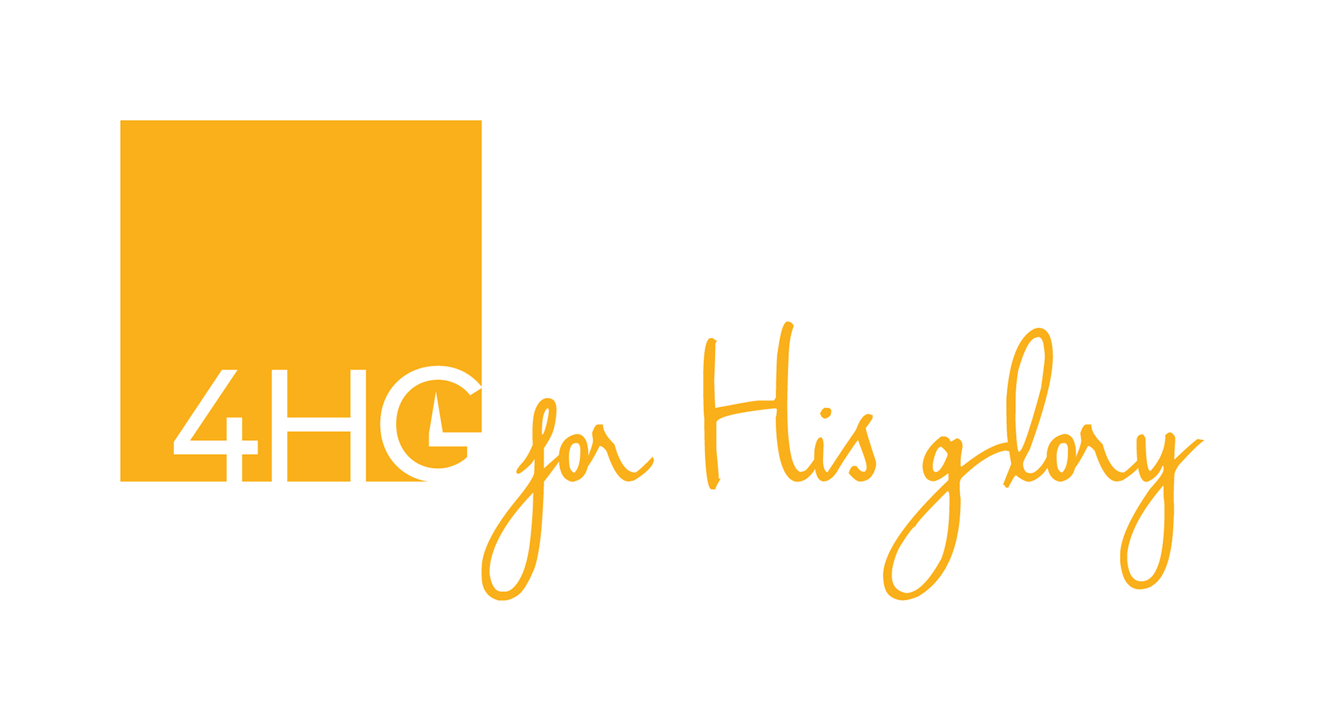
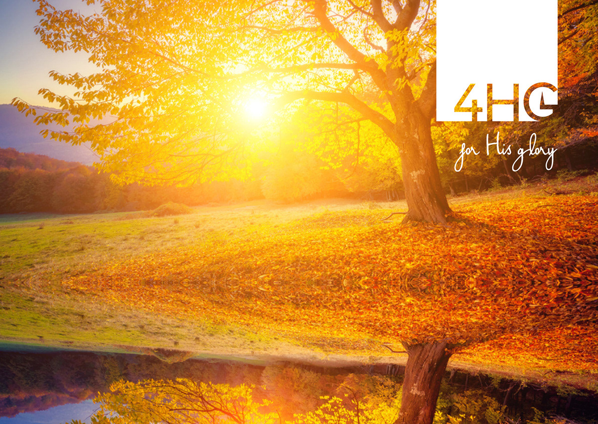
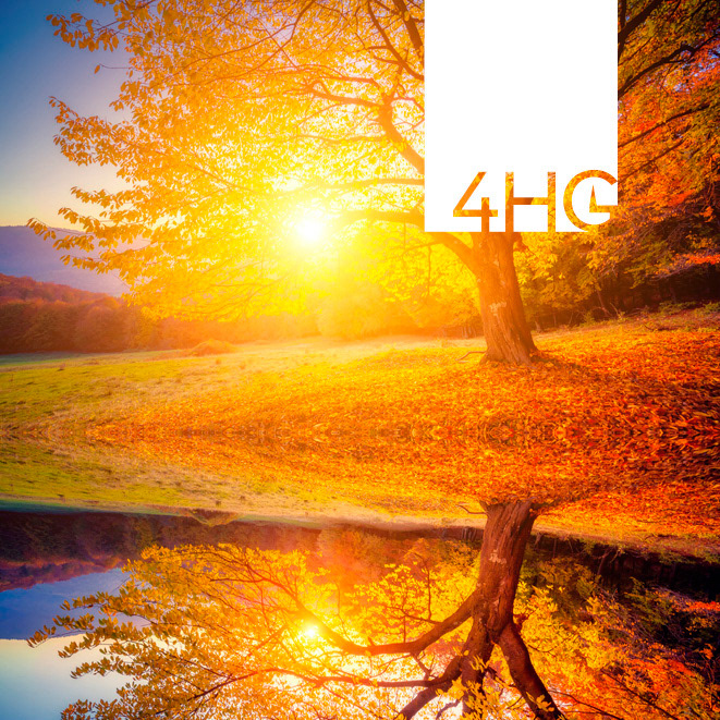
I chose to keep the golden yellow colour as the feature because I like it's warmth and joy, and it fits well with the branding image we had also decided upon.
I liked the idea of using a square as the base for the logo as it gives a sense of structure and consistency, while providing a solid foundation to build upon.
The 4HG that is cut out of the rounded corner of the square adds an element of difference and creativity to the structure and consistency of the square. The point in the middle of the 'G' was carried over from the previous logo, as we didn't want to lose that key idea that everything we do points upwards - for His glory. The strong yet clean font was chosen for the stability it provides, similar to the square base it is cut out of.
The font used for the wording below was chosen for it's creativity and freedom that it expresses, bringing a little bit of life and fun to an otherwise staunch logo. This font was found on Behance via Google.
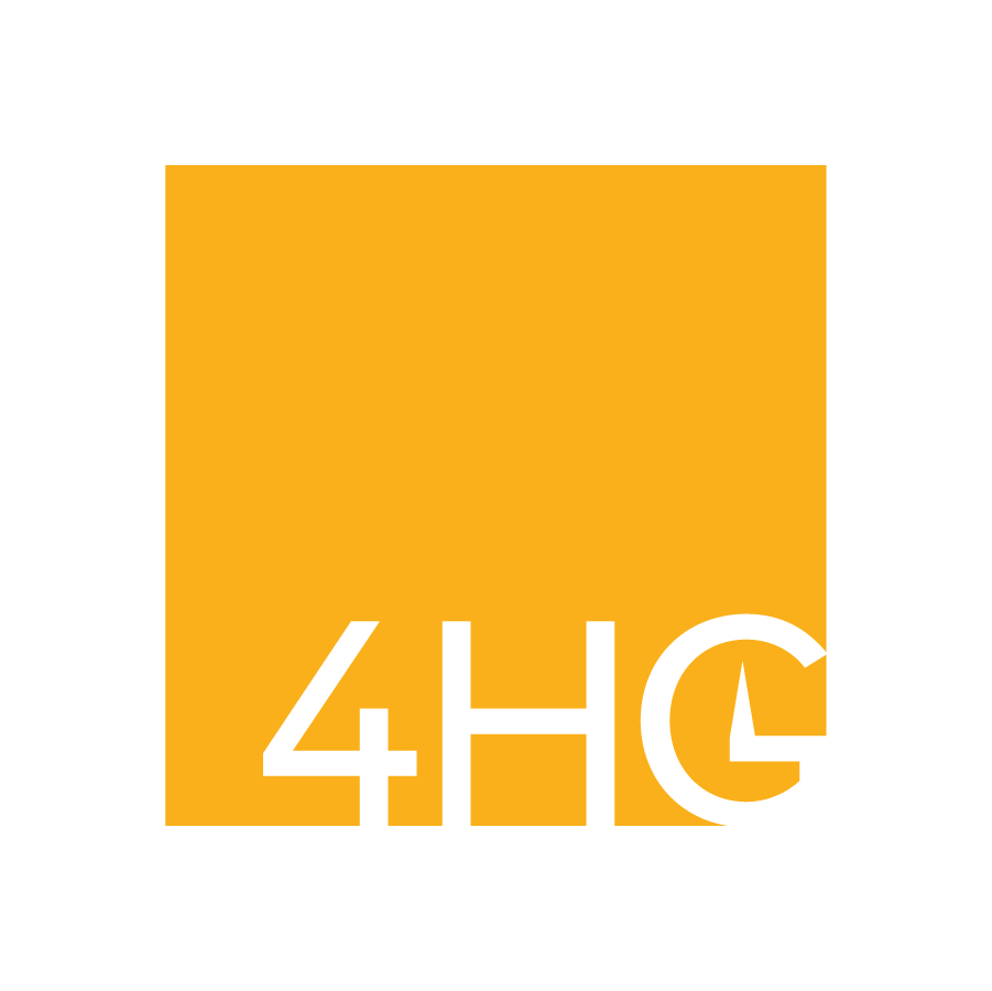
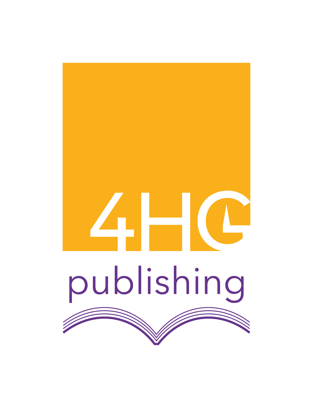
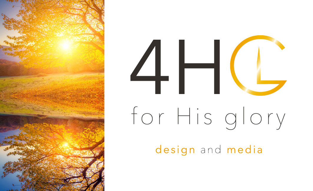
The logo below on the left was created specifically for the publishing arm of the 4HG Group to be used for invoicing and publishing account profiles.
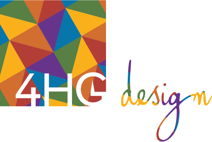
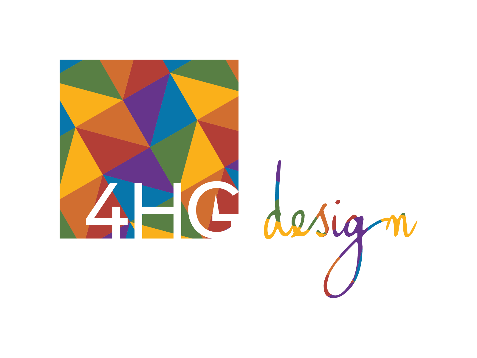
For the design arm, we opted for a colourful geometric pattern within the logo using each of our brand primary and accent colours as this felt like an appropriate take on our logo, hinting at my rainbow identity while representing the creative aspect of design.
The below was created for the podcast started by Daniel and Jokatama under the banner of the 4HG Group, so we tried to use colours and fonts from our existing brand as a nod to the group.
Branding Materials - including original brand
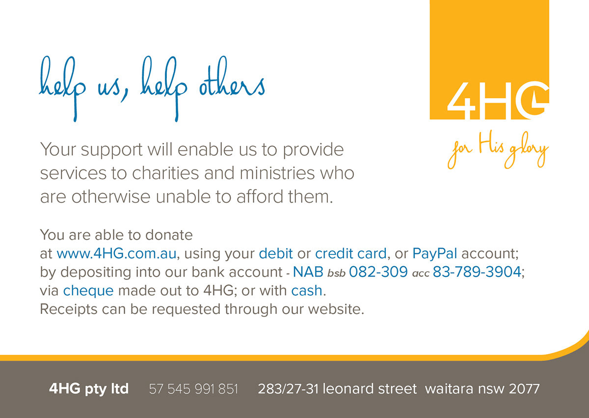
Below are some of the previous materials and designs done for 4HG with both new and original branding
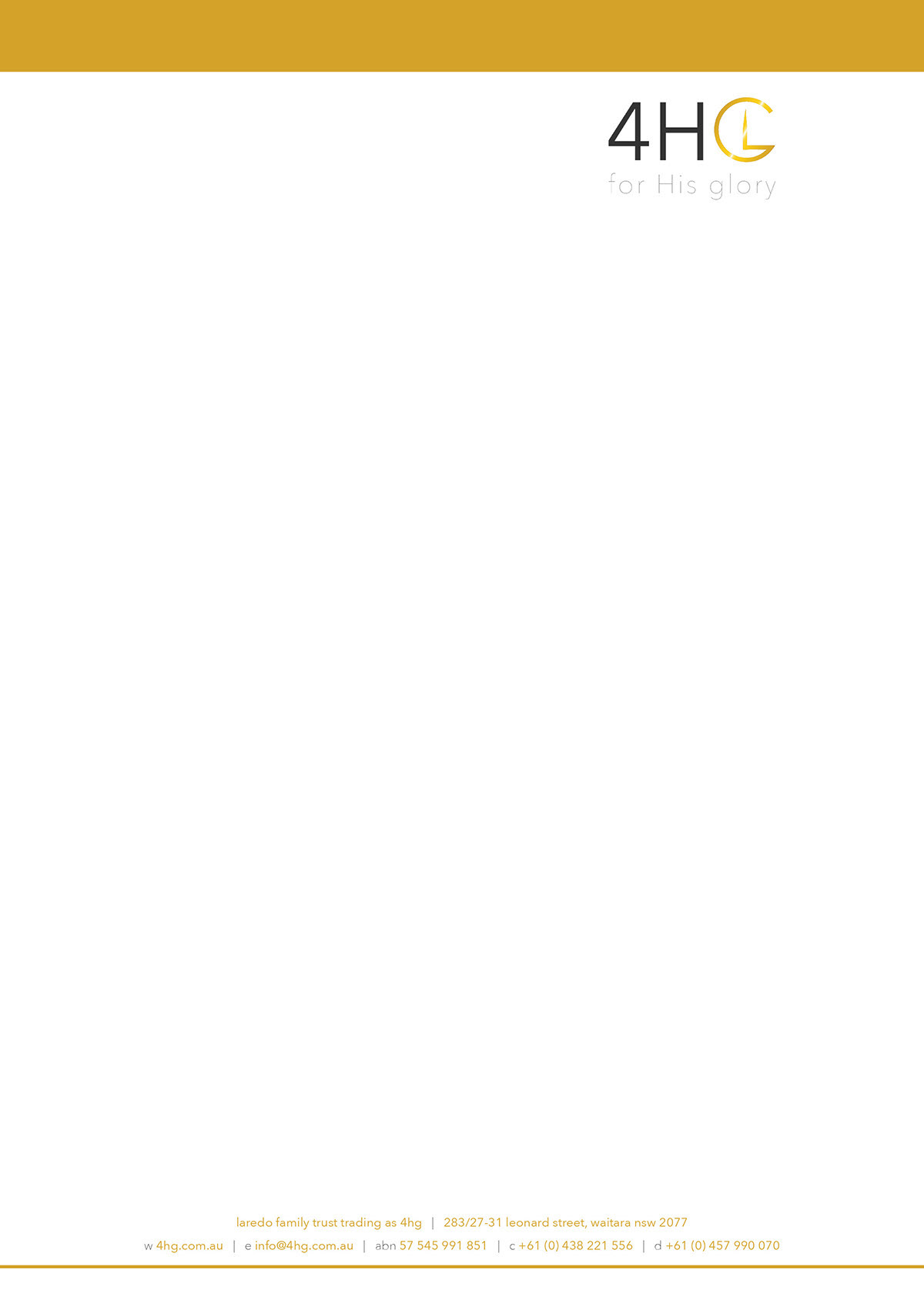
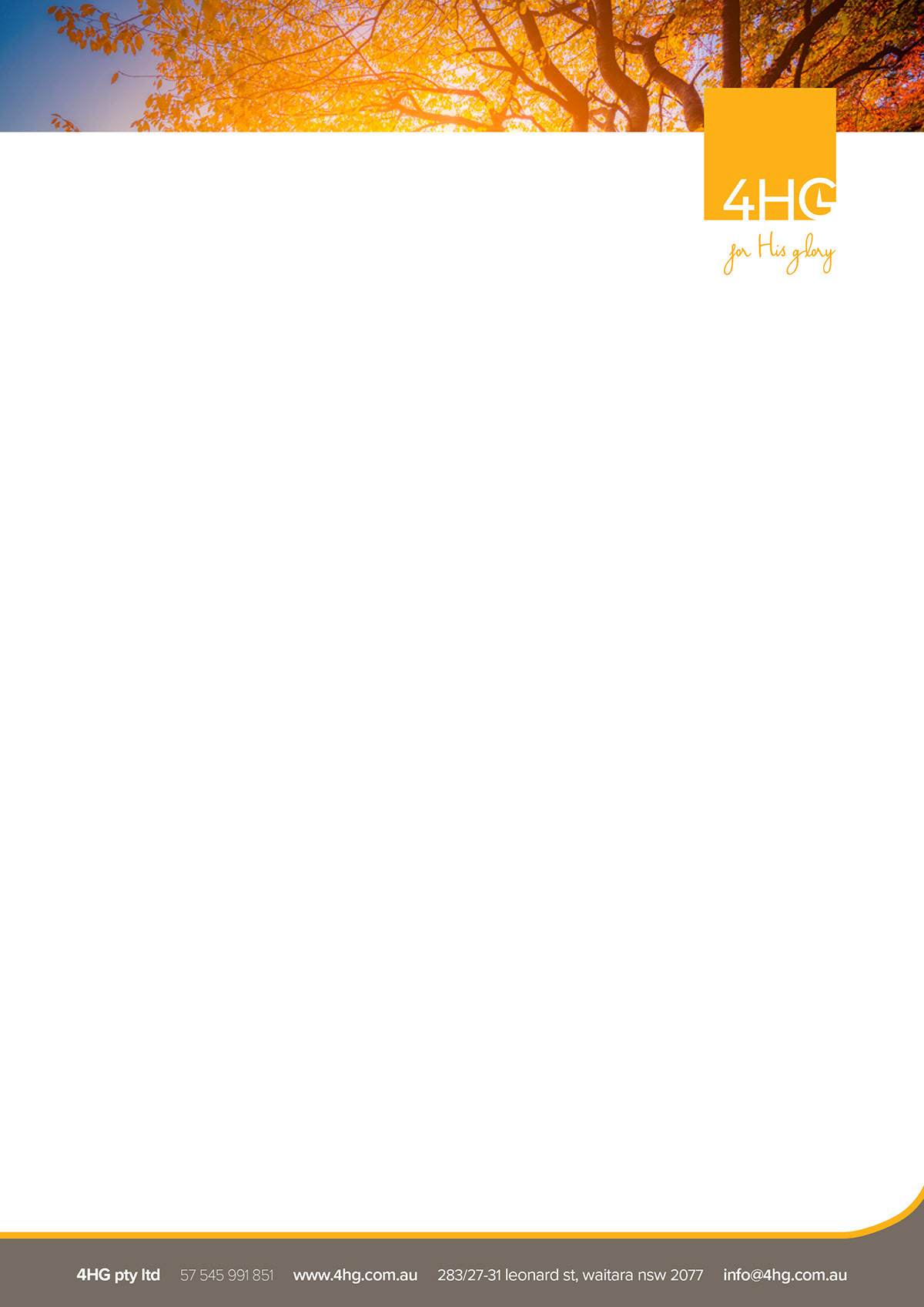
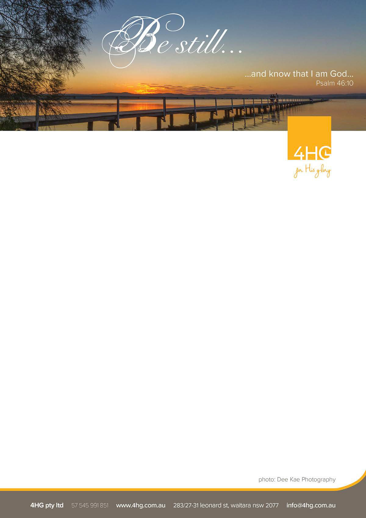
Below are a few letterheads that have been used for various purposes.
These were pledge cards we had printed for certain projects we were working on
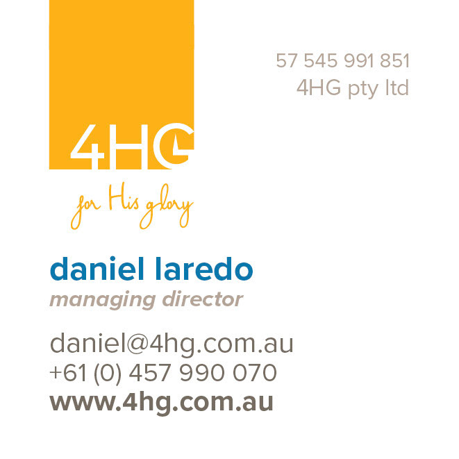
Below are both sides of our original business cards we had printed, followed by both sides of the square business card which is our most recent.
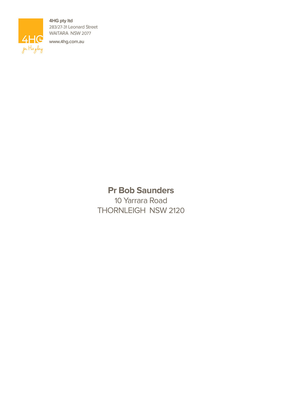
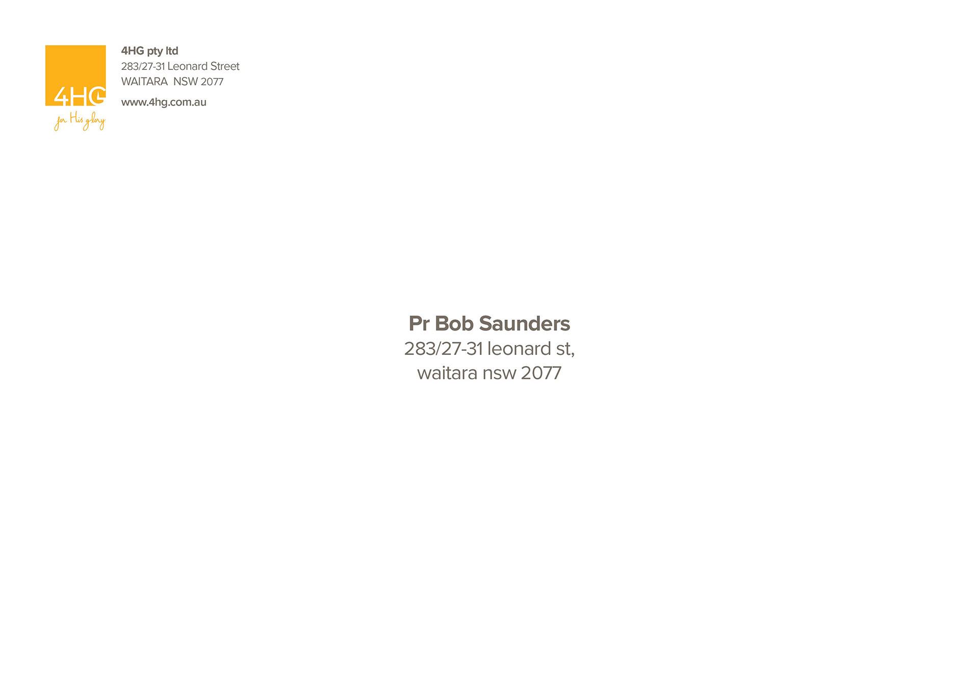
Below are the portrait and landscape versions of A4 sized envelopes followed by DL sized envelopes. We printed all of these ourselves.
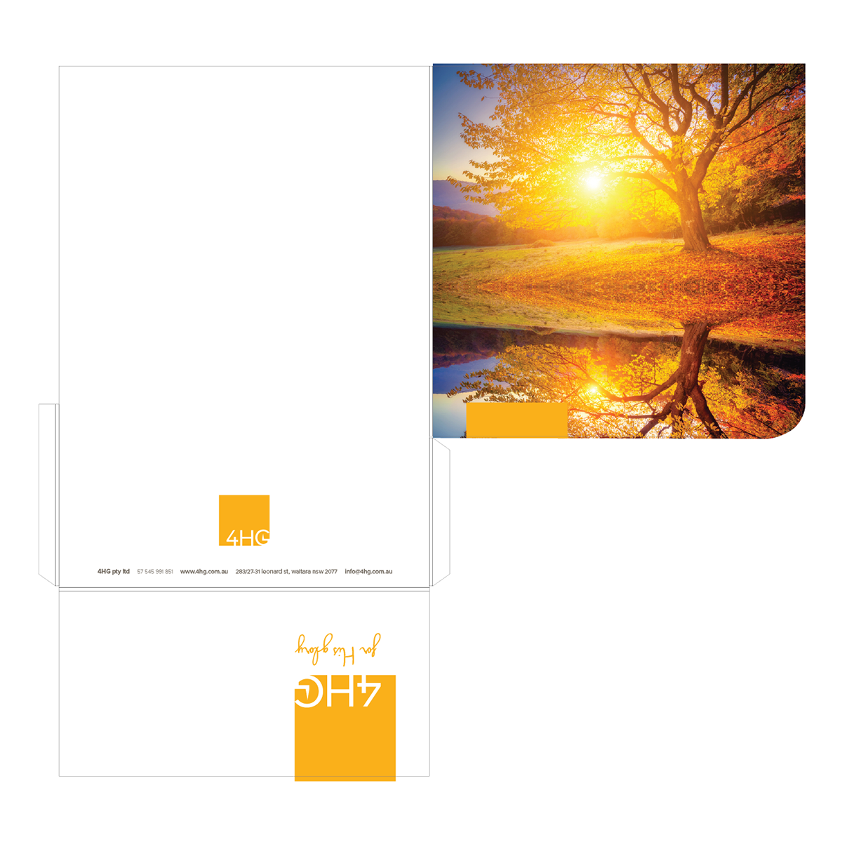
This was a document folder I designed to be printed on double sided card and then I cut and assembled these myself when ready to use for clients.